

Branding a women’s healthcare network
Challenge
Formed through a merger of regional OB/GYN practices, Axia Women’s Health (AWH) sought to form a progressive women’s health network across PA, NJ, and OH.
With investor support, AWH made numerous acquisitions of previously independent women’s health providers and set its sights on building a brand to compel teammates, practice owners, and patients alike.
With Finch Brands’ help, the company sought to answer a range of questions:
- Architecturally, would patients rally around or resent the idea of a network?
- If the brand is patient-facing, for what should it stand?
- How can we develop/reinforce core brand ideas at the practice level without feeling ‘too corporate’?
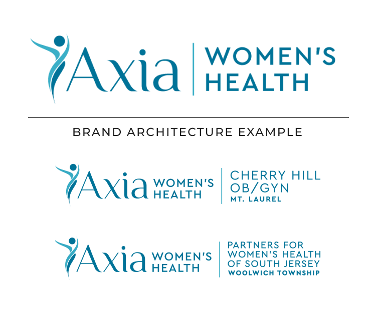
We built a brand architecture model that blends the network identity with local signifiers to simultaneously convey intimacy and scale.
This approach places a strong emphasis on positioning the master brand alongside local brands to create a balanced hierarchy. This builds equity for AWH while preserving the individual equity of local brands. It also allowed AWH to establish strong linkages across locations to foster community connections and standardize the brand's appearance for consistency.

Process
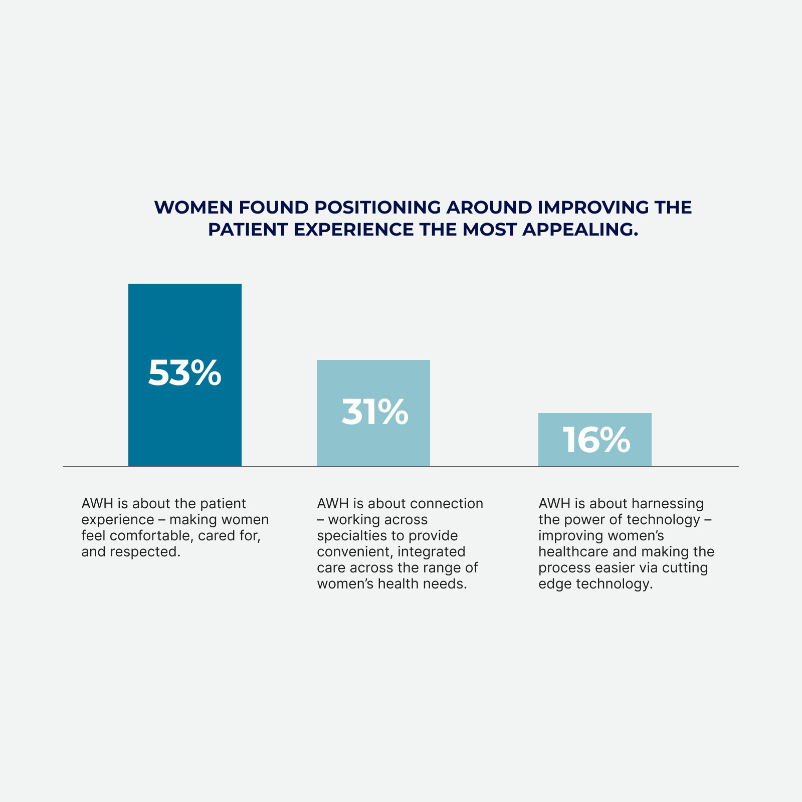
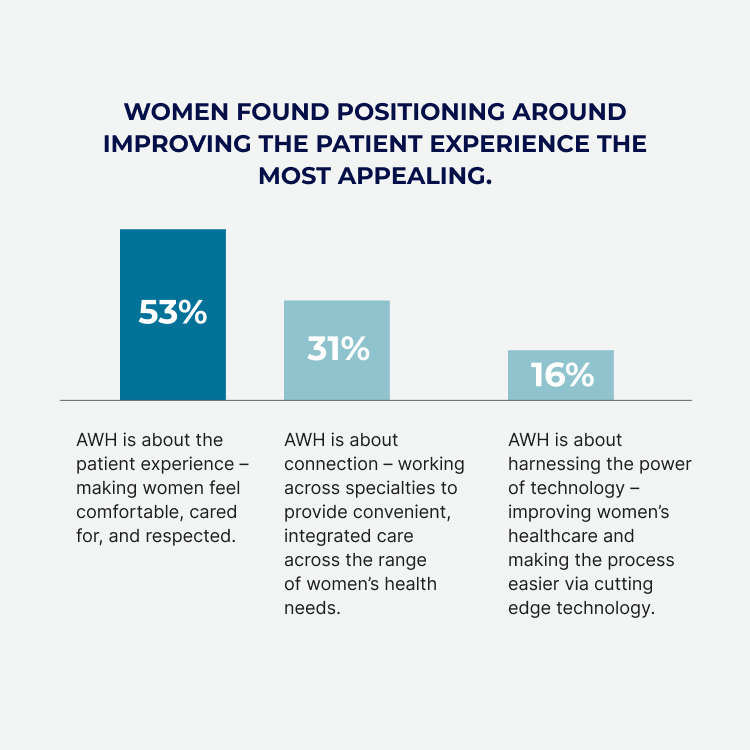
Finch Brands conducted a comprehensive employee/patient study to gain a deep understanding of needs, motivations, and barriers.
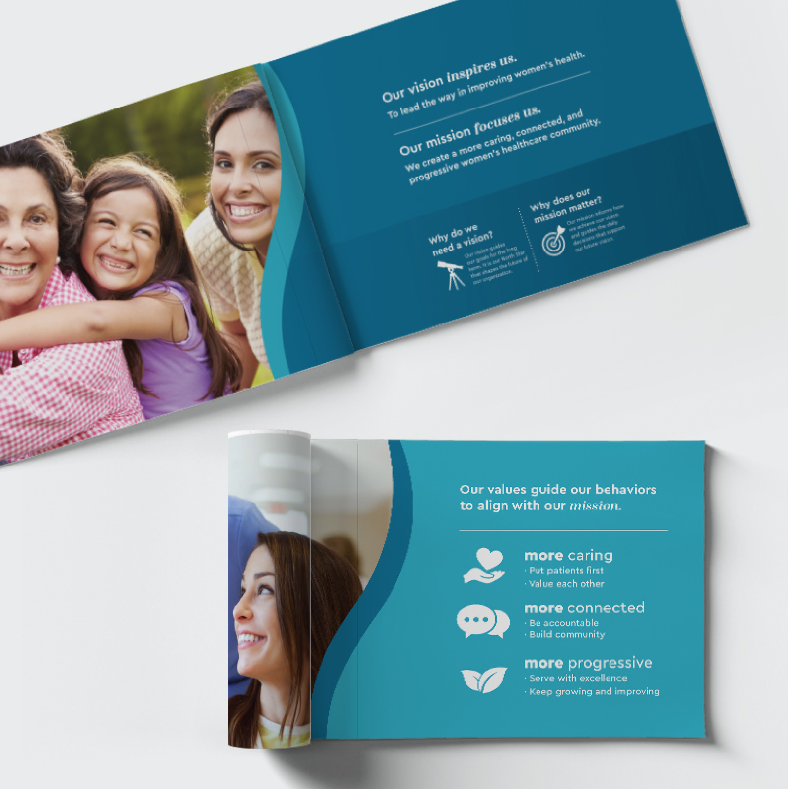
With this foundation, we developed a company Vision, Mission, and Values, along with a sweeping purpose-driven brand positioning behind the idea that “Women Deserve More”.

Together, Axia puts women first by connecting them to the total care they need to lead healthier, happier lives.
To help AWH go to market, we developed a comprehensive brand architecture playbook, brand anthem video, and completely overhauled the company’s website/materials to drive greater connections with key stakeholders. The tightly integrated brand – which aligns over 100+ practices, philosophies, and the provider/patient experience – became a key driver of Axia’s growth.

Sub-Brand Identity
For legal and perceptual reasons, the fertility subsidiary required a standalone identity. We created the ‘Sincera’ brand for this purpose.
The name ‘Sincera’ is a neologism that combines two key messaging elements – human-centered care (sincerity) with progressive clinical approaches (with the “-era” conveying innovation within a soothing feel).
The logo is an abstract butterfly form (conveying growth and development), which is paired with a solid font to express clinical excellence. The color palette, purple, was chosen for (a) its calming effect, (b) its uniqueness in the space, and (c) its blend of stereotypical masculine (red) and feminine (blue) tones.

Real-World Results
Under the Axia Women’s Health brand umbrella, the company has expanded both its practice base and services set. The fast-growing network includes over 100 sites in the Mid-Atlantic and Midwest and spans OB/GYN physicians, breast health centers, high-risk pregnancy centers, laboratories, urogynecology, fertility centers, and more.