Its Better in the Crest
Those in the Philadelphia region know that summer means two things – Phillies baseball and the Jersey Shore. In that spirit, Finch Brands was honored to be selected to brand one of those beloved towns ‘down the shore’ – the Borough of Wildwood Crest.
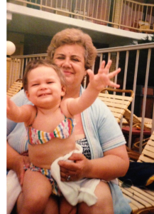 The Crest has a rich tradition. Many, like my family, come back year after year (26 years and counting). In this area, your shore town is one of the deepest traditions there is. And to their credit, Wildwood Crest commissioners recognized a need to differentiate their town – to express the joy it provides to so many every summer (and year round too).
Personally, I was very excited to contribute to this work. I have been visiting the Crest since I was a baby. To me, Wildwood Crest IS the Jersey Shore. I hadn’t known anything different until I was a teenager and started visiting other shore points with friends whose roots were elsewhere. Like a true Crest girl, I still always made my way back.
Beyond logo and tagline, this was an intriguing strategic endeavor. Wildwood Crest shares many things with its island neighbors Wildwood and North Wildwood – including incredible, free beaches and a strong hotel scene in the iconic Doo Wop style. Additionally, many appreciate proximity to the bustling boardwalk and nightlife of Wildwood proper, even if they seek to repair to a quieter place at the end of the day. Furthermore ‘The Wildwoods’ are frequently marketed as a portfolio – for those outside the region and seeking a sense of place, branding completely away from ‘Wildwood’ is not advisable.
At the same time, the Crest is distinctive. It truly is a mile away yet a world apart. It’s quiet and family oriented – with amazing recreational open space. And due to Sunset Lake on the ‘bay side,’ it’s the only Jersey Shore town where one can see the sun rise and set over water (more about that later). Plus, the moniker ‘The Crest’ is more than just shorthand – there is a strong desire among Wildwood Crest denizens and officials to be recognized for the community’s unique elements rather than lumped together with towns that may have a fundamentally different flavor and asset base.
Our work started off with interviews of key stakeholders and residents. These working sessions provided a ton of knowledge in addition to making the passion for the Crest almost palpable. I was excited to learn even more about my home-away-from-home and delighted to be reminded of aspects of the community I already knew about and loved.
After a few wonderful days in Wildwood Crest, the Finch Brands crew went to work. We experimented with a variety of colors, designs, and concepts. After some working time, we traveled back to the Crest to share our ideas with the commissioners and community. We loved hearing everyone’s opinions, as everyone comes to these sessions with different backgrounds and strongly held perspectives. We couldn’t be more proud of the outcome – it was a team effort and labor of love.
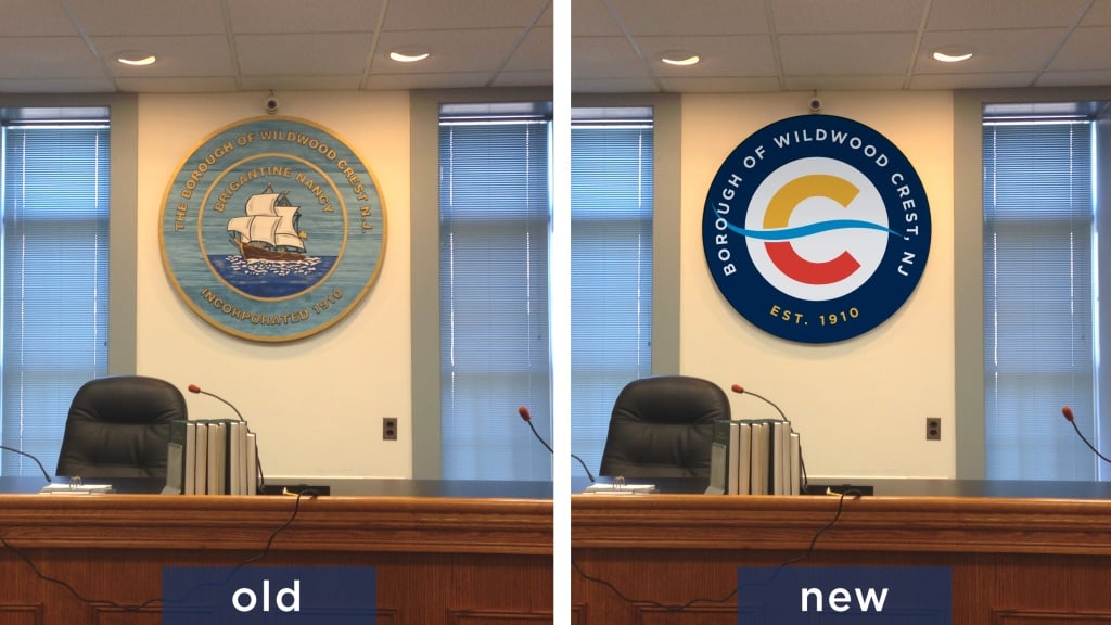
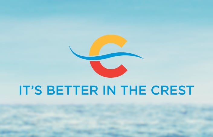
The logo was designed to set the mood for a quiet, intimate, outdoor-oriented beach town but in a way that doesn’t take the predictable route of flip-flops or seagulls. The vibrant colors are visually appealing and they befit a summer destination – the overall feel is contemporary but not trendy.
The dominant element, a capital ‘C,’ provides a link to the town name – and the color story shows the unique dichotomy of sunrise and sunset as experienced only in the Crest. Cutting through the icon, and paying off the sunrise-sunset metaphor, is a wave that gives the logo a bit of motion and positive spirit. After experimenting with various wave forms, we needed to be careful that it didn’t turn the ‘C’ into a ‘G’ or call to mind a mustache. Who knew there were so many ways to render a wave!
The core logo comes with several variations – we have typeset the name as either ’The Crest’ or the more official ‘Wildwood Crest’ and usage will depend on the venue. In addition, we provided a seal version for use in municipal activities.
 The tagline ‘It’s Better in the Crest’ has a memorable and rhythmic cadence and is descriptive of many aspects of life in the town. It is drawn almost directly from the pride key stakeholders expressed throughout the process. Beaches are better in the Crest, recreation is better in the Crest, life is better in the Crest.
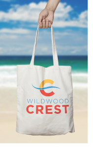
As we begin to dig into the next wave of items – website and other marketing materials – we’re excited to share this story and invite you to put a sticker on your bumper or laptop or to grab a beach tote before they’re gone. Our plan is to work with local leaders to fully deploy this identity package next summer. The countdown to Memorial Day is on!
—
Mandy Rippert, Brand Analyst
Hear more about this project on our podcast.
